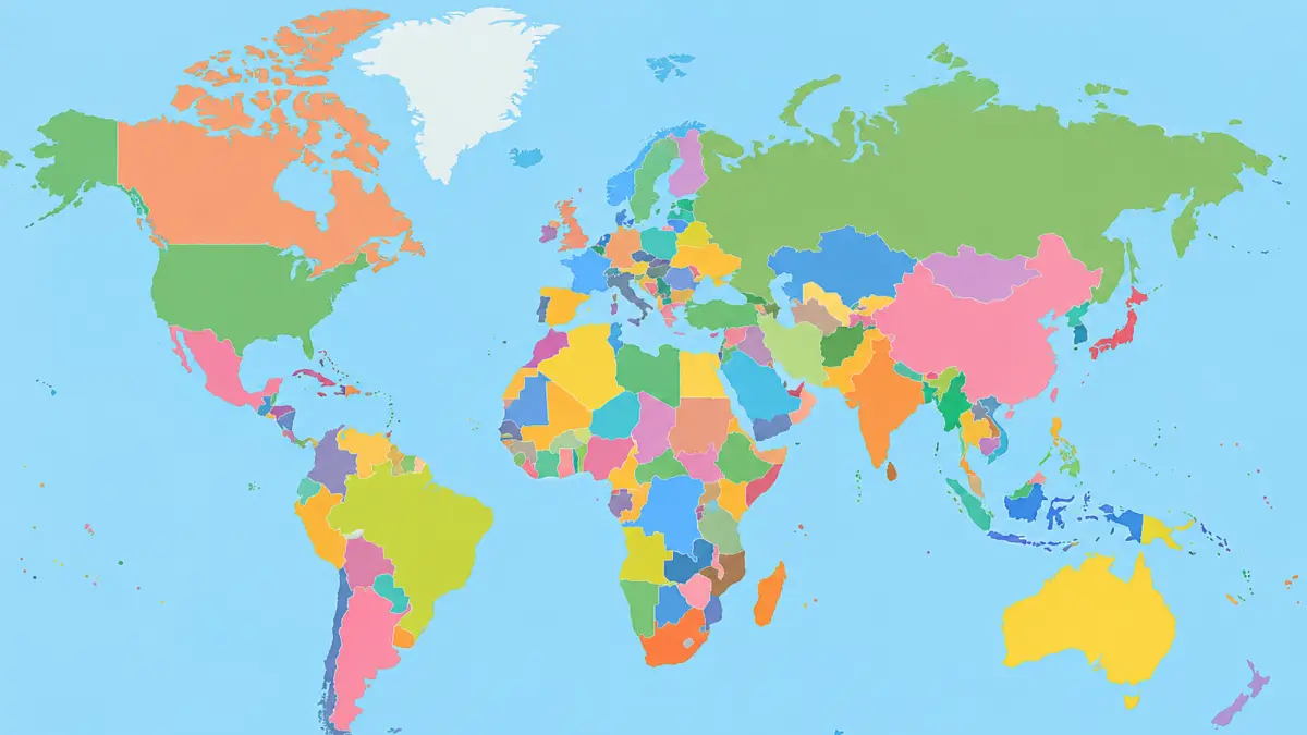
For centuries, the world has largely been represented using maps that make some countries and continents appear far larger or smaller than they actually are.
The widely used Mercator projection, created in the 16th century, was designed mainly for navigation rather than to accurately represent the size of landmasses.
Now, the Equal Earth projection is drawing attention for offering a more realistic comparison of continent and country sizes. The difference becomes particularly noticeable when Africa and Greenland are compared.
On a Mercator map, Greenland can appear almost comparable in size to Africa. In reality, however, Africa is roughly 14 times larger than Greenland. This striking difference results from how the Mercator projection represents areas at different latitudes.
Why Does the World Look Different on Maps?
The Earth is spherical, but a conventional world map is flat. Because of this, it is impossible to transfer the entire surface of the planet onto a flat sheet without introducing some form of distortion.
Flemish cartographer Gerardus Mercator developed the Mercator projection in the 16th century. Its main purpose was navigation.
The projection made it easier for sailors to plot routes because lines representing a constant compass direction could be drawn as straight lines.
However, this advantage comes with a significant trade-off. The projection increasingly stretches areas as they move farther from the equator and closer to the North and South Poles.
As a result, countries and regions at higher latitudes can look much larger than they are.
Africa and Greenland Highlight the Distortion
The comparison between Africa and Greenland is one of the clearest examples.
Greenland may look nearly as large as Africa on a Mercator map, but its actual land area is much smaller. Africa is approximately 14 times larger.
The same effect appears across other parts of the world. Russia, Canada, Europe and North America can appear larger because much of their territory lies at relatively high latitudes.
Meanwhile, Africa and South America, which are closer to the equator, can appear smaller than they are.
India also appears slightly larger in the Equal Earth projection than on some distorted map projections.
How Equal Earth Changes the Picture
A team of cartographers developed the Equal Earth projection in 2018. Unlike the Mercator projection, it prioritizes the relative size of landmasses.
When you place Mercator and Equal Earth maps side by side, the differences become easier to understand. Africa occupies significantly more visual space on the Equal Earth map, reflecting its actual size more closely.
North America and Europe appear smaller than they do on a Mercator map, while South America is represented closer to its true scale. The exaggerated appearance of regions near the poles is also reduced.
India, too, appears slightly larger on the Equal Earth projection.
The result is a world map that better shows how much land different parts of the planet actually occupy.
Is Equal Earth the 'Real Size' of the World?
Not exactly. Equal Earth does not show the Earth in its literal, undistorted form. Instead, it is an equal-area projection, meaning it preserves the relative areas of landmasses more accurately.
It also involves compromises.
For example, Equal Earth does not retain the navigation advantages of the Mercator projection. Straight lines on an Equal Earth map do not represent constant compass directions in the same way, and the projection cannot be used to measure the true distance between locations perfectly.
This is because no flat world map can preserve every property of a spherical Earth at the same time.
Why There Is No Perfect World Map
Every map projection involves some degree of compromise. A projection can prioritize area, shape, distance, direction or other characteristics, but preserving all of them simultaneously is mathematically impossible when representing a round planet on a flat surface.
The Mercator projection became popular because it solved an important problem for navigation. Equal Earth, by contrast, focuses on providing a realistic comparison of the sizes of continents and countries.
The Equal Earth projection has also gained institutional support, including adoption by African Union members in February.
Rather than making the Mercator map completely obsolete, the growing use of Equal Earth highlights an important point: the way the world looks on a map depends on the purpose for which that map was created.
For understanding the relative size of countries and continents, Equal Earth can provide a much more accurate visual impression than the traditional Mercator projection.
The UN's move in September 2026 has brought the issue into the headlines. The UN has backed Equal Earth as an option for more accurate representation of continental landmass sizes.
Cartographers created Equal Earth; African-led organizations and the African Union pushed for wider adoption; and the UN's recent decision has brought it into the global spotlight.